Introduction
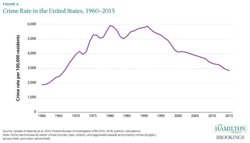
Over the past several decades the national experience of crime and incarceration has fluctuated dramatically. Crime rose between the 1960s and 1980s, but has declined since 1990. Incarceration began rising sharply in the 1980s and peaked in the 2000s before starting to fall.
The high rates of incarceration over the last three-and-a-half decades have resulted in a large population of formerly incarcerated individuals across the United States. For these Americans, it can be challenging to come home and integrate into their communities while also trying to reenter the labor force.
Successful reintegration is not just a concern for those who return from prison: it is also a matter of public safety and economic necessity. Accordingly, a criminal justice system that emphasizes incarceration but does not support the journey home does a disservice to the formerly incarcerated as well as to the public. Reducing recidivism is critical for community safety; providing effective rehabilitation and skill development for those incarcerated and formerly incarcerated is critical to strengthening households and the economy.
Read Full Introduction
Understanding both the criminal justice system—in all of its state and local variations—and the individuals who interact with it is essential in order to devise policies that will be effective in promoting successful reintegration into society. With almost 7 million Americans living under correctional supervision in 2014, and tens of millions more who have exited supervision, the potential benefits of effective reentry policies are far-reaching.
In order to create effective reentry policies and programs, we must assess the characteristics of the currently incarcerated population and the population of individuals who are reentering the community. These two groups are different in ways that matter for policy. Those who are incarcerated are serving longer average sentences, often for crimes that involve violence. By contrast, parolees are much more likely to have been sentenced for a drug-related or other nonviolent crime.
Researchers have gained valuable insights into recidivism patterns. For example, recidivism rates are highest immediately after release from prison and fall thereafter. The tendency for recidivism to occur early is matched by a shockingly high rate of death in the weeks and months after an individual exits prison. These individuals face very high rates of drug overdose, homicide, and suicide (Binswanger et al. 2007). At least some— and hopefully many—recently incarcerated individuals can be aided with targeted reintegration programs that smooth the transition to life in the community. In addition, recidivism is much lower for those with relatively little previous interaction with the criminal justice system. Both patterns suggest ways of tailoring programs aimed at those leaving prison; for instance, it might be particularly critical to intervene immediately and help reentering workers obtain and retain employment.
People who have ever experienced incarceration are more disadvantaged than are people in the population as a whole. Those with only a high school education or less are at a much higher risk of incarceration than are those with four-year college degrees, and those with low family incomes are at a substantially higher risk than are those with high family incomes.
When those with criminal records do manage to reenter the labor market, they face an experience that is very different from that of their counterparts who have never been incarcerated. The level and growth of earnings are both lower for those with an incarceration history. Workers with criminal records generally get a tepid reception from potential employers who often have concerns about these applicants’ suitability for employment. For the large number of black workers with criminal records, obtaining employment is even more difficult (Pager 2003). Finding ways to develop the skills of the formerly incarcerated and communicate their employability is therefore both difficult and vital.
A founding principle of The Hamilton Project’s economic strategy is that long-term prosperity is best achieved by fostering economic growth and broad participation in that growth. Increasing the opportunities of incarcerated and formerly incarcerated Americans to rejoin our communities as productive members is necessary on both economic and moral grounds. Sound evidence and careful research will play an important role in making this a reality.
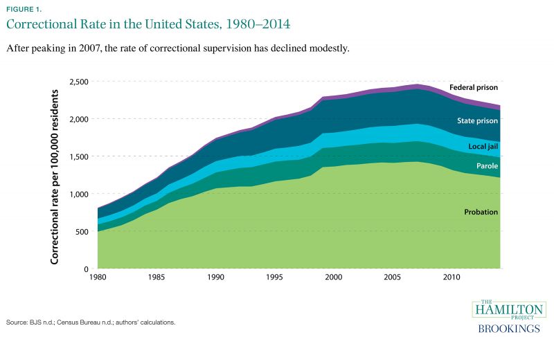
Fact 1: The share of Americans under correctional supervision more than tripled from 1980 to 2007.
Over the past 30 years incarceration in the United States has increased to unprecedented levels, with about 2.25 million Americans held in local jails or in state and federal prisons in 2014 (Bureau of Justice Statistics [BJS] n.d.). As a result, the United States incarcerates 698 out of every 100,000 residents, almost five times the average rate among OECD countries (Walmsley 2016). Millions more live under parole or probation, which typically follow a period of incarceration or substitute for incarceration, respectively. Collectively, the U.S. population living under correctional supervision—which includes incarcerated individuals as well as those under parole and probation—has risen from 1.84 million in 1980 (0.8 percent of the population) to about 6.85 million in 2014 (2.1 percent of the population; Census Bureau n.d.).
Since peaking in 2007, the share of the U.S. resident population under correctional supervision has fallen by 0.3 percentage points, from 2.4 to 2.1 percent. The inflow of new incarcerations peaked earlier, in 2006 (Carson 2015), but long prison sentences have muted the effect of declining prison admissions on the size of the prison population. Almost four-fifths of the decline since 2007—0.2 percentage points—can be attributed to the falling share of people under community supervision. The rate of incarceration, meanwhile, has fallen by less than 0.1 percentage points.
What explains the long-run rise and the recent moderate decline in correctional supervision? Crime rates rose dramatically until the 1990s before subsequently falling (Kearney et al. 2014), contributing to increased incarceration. In addition, the expected duration of incarceration rose substantially and then fell slightly after the 1990s (see Fact 2). Policy changes, such as the adoption of mandatory minimum sentences, likely increased the number and duration of incarcerations (Raphael and Stoll 2013; Neal and Rick 2016).
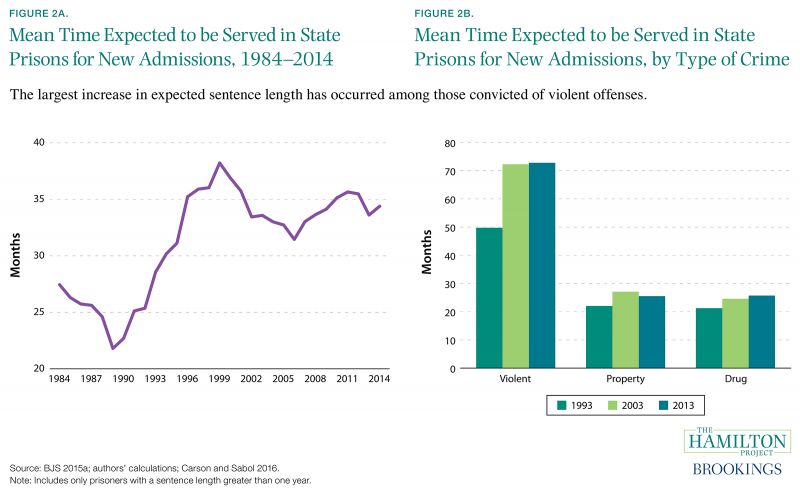
Fact 2: State prisoners serve about three years on average for their crimes—a one-quarter increase since 1984.
Prison populations can increase when more people enter prison or when convicted prisoners receive longer sentences. As shown in figure 2a, expected time served in state prisons rose from 27 months in 1984 to 34 months in 2014. Expected time served in federal prisons has also increased, from 21 months in 1984 to 42 months in 2014 (not shown).
Moreover, expected time served has increased for each of the three major crime categories, as shown in figure 2b. However, the largest proportional and absolute increase occurred for offenders convicted of violent crimes, whose expected time served increased from 50 months in 1993 to 73 months in 2013. This increase has occurred even as the share of new admissions for violent crime has held roughly constant, at 28 percent (Carson and Sabol 2016).
The rise in time served is often attributed to tough-on-crime policies that were adopted in the 1980s and 1990s to address the high crime rates of that period (Neal and Rick 2016). However, evidence for the deterrence benefits of increased sentence length is mixed (Abrams 2012; Doob and Webster 2003), and the effect of additional incarceration on crime rates appears to have declined over time (Johnson and Raphael 2012). Given that average sentence lengths are currently quite long by historical standards, the deterrent benefit of still longer sentences is likely to be minimal (Travis et al. 2014). Crime deterrence can also depend on many other factors, such as the individual’s perception of the likelihood of punishment or her risk preferences (Nagin 1998).
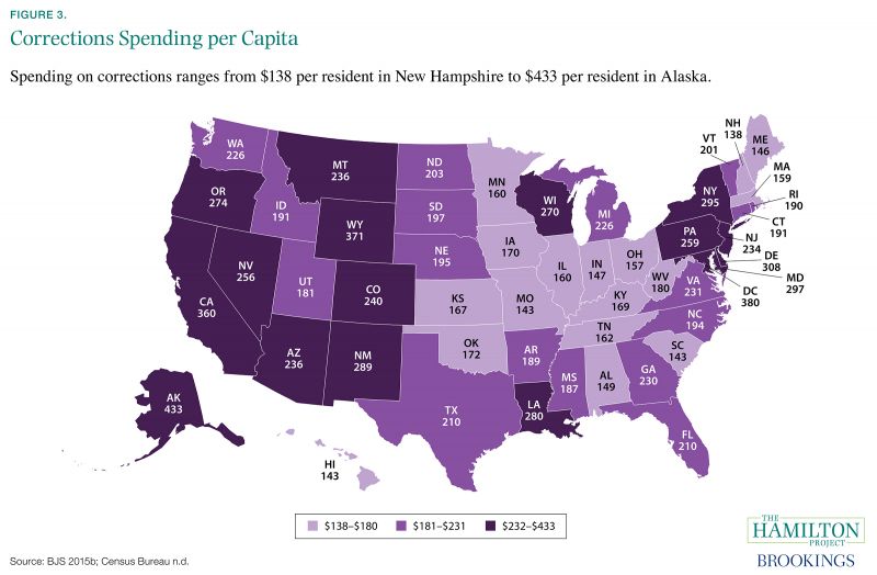
Fact 3: Corrections spending varies widely across states.
In 2012 the United States spent more than $265 billion ($845 per person) on criminal justice, including corrections, policing, and judicial expenses (BJS 2015b; Census Bureau n.d.). States and local governments shoulder the largest share, totaling $213 billion (BJS 2015b).
Corrections spending is the most relevant category for incarceration and reentry, because it includes spending for parole and probation, confinement of those convicted of offenses and those waiting for trial or adjudication, and rehabilitation (BJS 2014a). In total, state and local governments spent $72.5 billion on corrections in 2012, compared to an inflation-adjusted $20.3 billion in 1982 (BJS 1997, 2015b; Bureau of Labor Statistics [BLS] n.d.a). In recent years some states have begun to respond to increasing incarceration-related budget pressure through reforms that aim to decrease correctional populations and spending (Center on Budget and Policy Priorities 2014).
States vary widely in their corrections spending. For instance, Missouri spends relatively little on corrections, at $143 per resident, while California spends $360 per resident. In general, states in the South and Midwest spend the least, while those in the West and Mid-Atlantic spend the most. Variation in spending reflects variation in incarceration rates, as well as other factors such as differences in wages for corrections employees. Regardless of the underlying explanation, efforts to reduce prison populations might be especially attractive in states like California where corrections spending is high.
Substantial differences exist in states’ allocation of criminal justice spending, as well. On average, states spend roughly half of their criminal justice budgets on policing, another third on corrections, and a fifth on judicial and legal expenses. In Pennsylvania more money is spent on corrections than on policing (40 percent versus 39 percent). In Massachusetts, on the other hand, a quarter of justice spending goes to corrections, while more than half (52 percent) goes to policing (BJS 2015b). These differences in part reflect varying community needs and policy priorities.
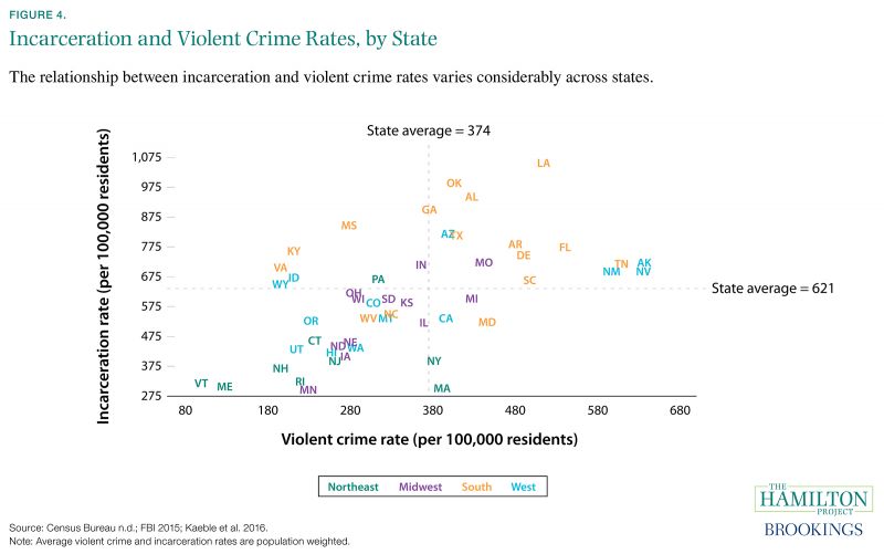
Fact 4: Many states with similar rates of violent crime have different rates of incarceration.
Our criminal justice system is predominantly state based, with states’ policy decisions affecting far more people than federal policy decisions. This complicates the analysis of the U.S. criminal justice system, given that states differ in terms of policy and experience of crime. Figure 4 shows the wide variation in both incarceration rates and violent crime rates across the states.
In 2014 violent crime rates per 100,000 residents ranged from 99 in Vermont to 636 in Nevada; similarly, incarceration rates per 100,000 residents ranged from 297 in Minnesota to 1,056 in Louisiana. Much of this variation is regional, with southern states generally having high crime and incarceration rates, and northeastern states having low crime and incarceration rates.
Higher rates of incarceration are generally associated with higher rates of violent crime, as shown in figure 4. States with similar rates of violent crime nonetheless vary considerably in their incarceration rates. For instance, Massachusetts and Oklahoma have very similar rates of violent crime, but quite different rates of incarceration: Oklahoma imprisons almost 700 more people per 100,000 residents than Massachusetts does. To some extent, these differences reflect policy choices made by states regarding the punitiveness of their criminal justice systems (Neal and Rick 2016).
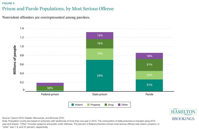
Fact 5: Federal prisoners constitute a small share of the total prison population and are disproportionately likely to be drug offenders.
Federal sentencing reform (e.g., the Fair Sentencing Act of 2010 and the Retroactive Crack Cocaine Guideline Amendment of 2011) has tended to focus on reducing sentences for drug offenders. However, given that drug offenders constitute a relatively small fraction of the total prison population, such reforms are likely to have a limited impact on the overall level of incarceration. In 2014 there were more than 1.5 million individuals with a sentence of one year or more in either federal or state prisons. Of these, the vast majority—approximately 87 percent—were in state prisons.
State and federal prisoners differ in the type of offense that leads to incarceration. More than half of federal prisoners are incarcerated for a drug offense, compared to just 16 percent of state prisoners. Conversely, more than half of state prisoners are incarcerated for a violent crime, compared to just 6 percent of federal prisoners (Carson 2015).
Nearly half of the combined state and federal prison population was sentenced for violent crimes. By comparison, of the parole population—approximately 860,000 individuals—slightly fewer than a third are violent offenders. This means that those who are leaving prison on parole tend to be nonviolent offenders, a fact that is likely relevant to discussions of reintegration.
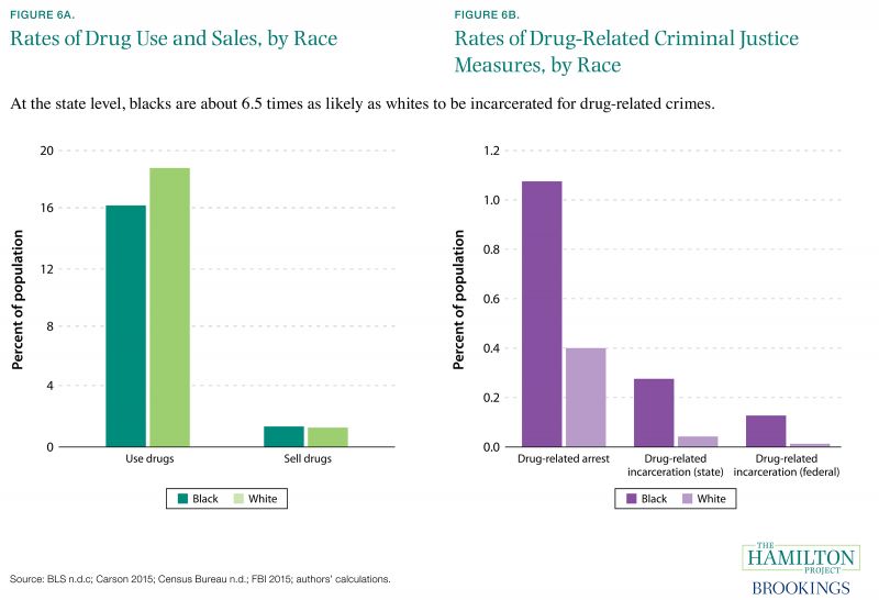
Fact 6: Black and white Americans sell and use drugs at similar rates, but black Americans are 2.7 times as likely to be arrested for drug-related offenses.
The disparate criminal justice experience of black Americans has played an important role in reform discussions. Differences in incarceration rates are stark: in 2007 a black man between the ages of 18 and 25 without a high school diploma was more than three times more likely to be incarcerated than a non-Hispanic white man of the same age and education level (Raphael 2011).
However, it is challenging to relate rates of criminal activity to differences in punishment. Data limitations make it helpful to focus on one type of criminal activity—drug-related crimes—and to allow for comparison by race between reported rates of selling and using illicit drugs to drug-related arrests, sentences, and incarceration.
Using the National Longitudinal Survey of Youth, we calculate rates of selling and using illicit drugs by race. Blacks and whites sell and use drugs at similar rates, as shown in figure 6a. However, the probability of experiencing criminal consequences is much higher, and those consequences are likely more severe, for blacks.
Blacks are 2.7 times as likely as whites to be arrested for a drug-related crime, and receive sentences that are almost 50 percent longer. Furthermore, blacks are 6.5 times as likely to be incarcerated for drug-related offenses at the state level. Drug-related crime is certainly a broad category that does not allow for distinctions to be made regarding the seriousness of the drug-related crime. Nevertheless, figure 6 suggests that criminal justice consequences by racial group are not proportional to rates of criminal activity.
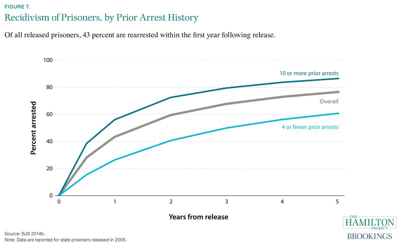
Fact 7: 77 percent of released prisoners are re-arrested within five years.
In the most recent study of recidivism, 77 percent of state prisoners who were released in 2005 had been arrested again by 2010. Recidivism is highest immediately after release: 43 percent of released prisoners are rearrested during the first year. By contrast, those who are not quickly rearrested are less likely to recidivate. Measured in terms of incarceration rather than arrest, recidivism is lower: 55 percent of released state prisoners had a parole or probation violation or a new arrest that led to reincarceration during the first five years (BJS 2014b).
Notably, inmate recidivism increases with criminal history: in the first year of release, 56 percent of those formerly incarcerated with ten or more prior arrests were arrested again, compared to 40 percent of prisoners with five to nine prior arrests (not shown), and 26 percent of prisoners with four or fewer prior arrests. This has implications for how recidivism rates are calculated: Prisoners who are at a high risk for rearrest—for instance, those with many prior arrests—are disproportionately likely to be included in a sample of individuals exiting prison in any particular year. Consequently, conventional recidivism studies such as the one shown in Fact 7 are more reflective of the recidivism experience of those prisoners (Rhodes et al. 2014).
Individuals with less extensive criminal records are at a lower risk for recidivism than conventional statistics suggest. More-careful use of recidivism statistics can help employers and others to assess the actual risks of recidivism posed by particular individuals with criminal records.
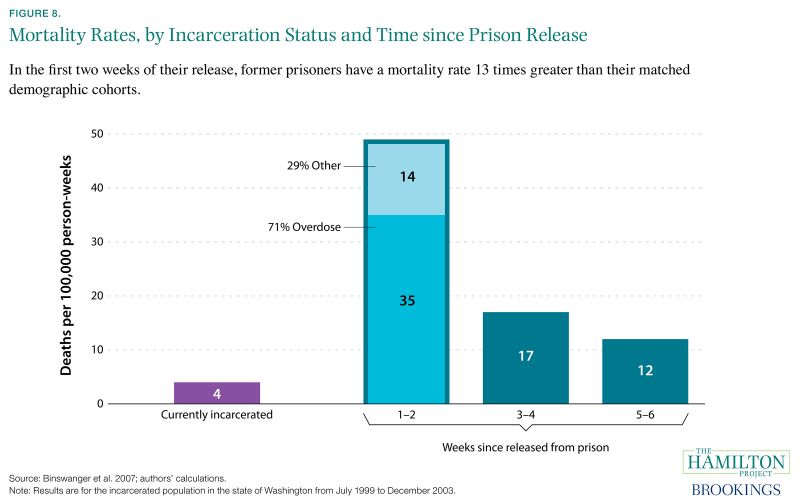
Fact 8: Recently released prisoners experience much higher mortality rates than the general population.
In data from the state of Washington, mortality rates are much higher immediately after released prisoners leave prison than before or afterward. In the first two weeks after release, the mortality rate is 49 deaths per 100,000 person-weeks, falling quickly to 17 deaths per 100,000 person-weeks in the subsequent two-week period. This mortality rate immediately following release is much higher than the mortality rate of the incarcerated population, which is only 4 deaths per 100,000 person-weeks.
Additionally, the highest mortality risk for released prisoners during the first two weeks after release is drug overdose, accounting for nearly three-quarters of deaths during that period.
Elevated mortality rates for former prisoners suggest that they might benefit from additional services immediately following release from prison. Lack of necessary identification documents, interruption in needed medical care, and even lack of appropriate civilian clothing all constitute barriers to successful reintegration.
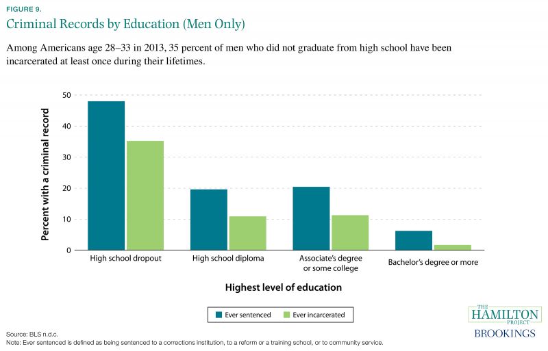
Fact 9: Low-skilled individuals are more likely to have a criminal record.
Criminal records constitute an important barrier to employment (see Fact 11). As shown in figure 9, criminal records are distributed unevenly across the population. Less than 2 percent of men aged 28 to 33 with at least a four-year college degree report having been incarcerated at some point, compared to 35 percent of male high-school dropouts in the same age group. Men with a GED (not shown) also report relatively high rates of ever having been incarcerated, at 36 percent, though this might be due to GED programs that are available in prison. Rates of sentencing follow the same pattern, but with larger fractions of men reporting that they have received a sentence at some point in their lives.
Criminal records are also more common for those with low incomes (not shown). About a fifth of those with family incomes lower than $30,000 have ever been incarcerated, while only 5 percent of men with family incomes above $90,000 have ever been incarcerated.
The association between skill level and criminal records reflects complex underlying relationships. Importantly, the characteristics associated with higher incarceration rates are a factor in producing low educational attainment and income. For example, growing up in a high-poverty neighborhood leads to both reduced future wages and to a higher likelihood of criminal activity (Chetty and Hendren 2015; Kling et al. 2005). In addition, workers with poor market opportunities might see illicit activity as an attractive alternative to legal work (Doyle, Ahmed, and Horn 1999; Mustard 2010), specially since having a criminal record directly weakens labor market opportunities (Agan and Starr 2016; Holzer 2007; Pager 2003).
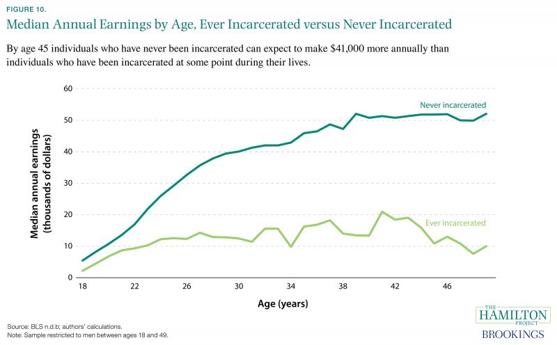
Fact 10: Incomes of the formerly incarcerated grow little with age compared to those who have never been incarcerated.
The negative association of incarceration with earnings increases throughout adulthood. As shown in figure 10, individuals who were incarcerated at least once during the period 1979–2012 earn substantially less than those who were never incarcerated. This discrepancy widens with time: at age 20 the difference is only about $4,000, but by age 45 the difference has widened to about $41,000 annually. A very similar discrepancy can be found when focusing only on black or Hispanic men with a high school education or less.
It would be a mistake to ascribe the entire difference in earnings trajectories for these groups to the impact of incarceration itself. Those who report having been incarcerated are disadvantaged in a number of respects that predate their incarceration. As discussed in Fact 9, educational attainment is a major factor. On average, those who have never been incarcerated obtain 2.3 more years of education than those who were incarcerated at least once (BLS n.d.b).
However, collateral consequences of incarceration are likely an important restraint on the growth of earnings for those who have been incarcerated. These consequences include denial or revocation of occupational licenses (see Fact 12), missed work experience while incarcerated, difficulty obtaining employment (see Fact 11), and accrued financial liabilities (e.g., child support) that discourage formal employment, among other possibilities (Pettit and Western 2010a, 2010b; Raphael 2011).
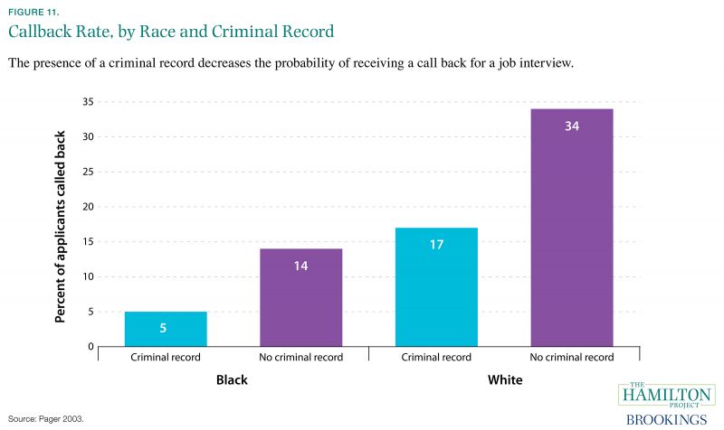
Fact 11: Race and criminal history influence the probability of receiving a job interview.
One way to estimate the labor market effects of race and criminal history is through audit studies. For example, researchers might send coached applicants to employers with the intention that the applicants differ only by the variable of interest—in this case, race or criminal record. In one such study described in figure 11, possession of a criminal record is found to decrease the probability of being called back for an interview for both white and black applicants (Pager 2003). In fact, though, white applicants with a criminal record have a better chance of receiving a callback than do black applicants without a criminal record.
In a recent working paper Agan and Starr (2016) find that after a “Ban the Box” policy was implemented—in which criminal history information is withheld from employers until the end of the hiring process—the gap between callback rates for whites and blacks increased. This might suggest that employers engage in more racial discrimination when prevented from easily learning about an applicant’s criminal record status. Note, however, that efforts by public employers to make less use of criminal record information might have had positive effects, as documented by the National Employment Law Project (2016).
Work by Holzer, Raphael, and Stoll (2006) supports the idea that some employers use racial information as a stand-in for criminal history. They find that employers with access to criminal history information are more likely to hire black Americans, particularly black men. Interestingly, employers who conduct background checks are also more likely to hire from other stigmatized groups, such as those with extensive gaps in their prior work history. In the absence of criminal history information, employers are left to infer who has a criminal history using other, cruder signals, possibly resulting in discrimination by race.
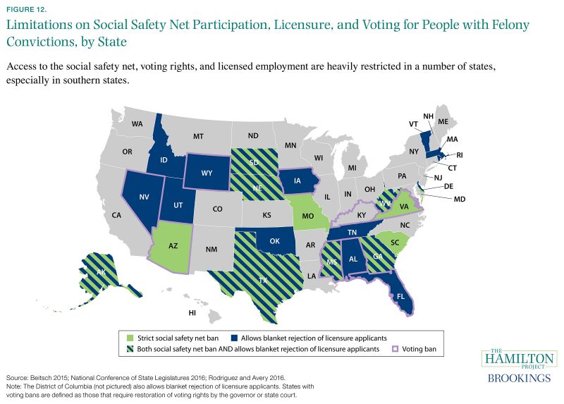
Fact 12: Some states ban those with felony conviction from safety net programs, voting, and licenses to work.
The adverse consequences of a criminal record can be far-reaching. Access to the safety net is affected by criminal records, with 12 states (shown in green) placing strict restrictions on access to Temporary Assistance for Needy Families (TANF) or Supplemental Nutrition Assistance Program (SNAP) for people with felony convictions. All the states highlighted in green have TANF bans, and seven of those states also have bans on SNAP for people with felony convictions. Other states that are not indicated on the map have partial SNAP and TANF bans. For example, some of these states might make benefits available only after the applicant submits to drug testing or completes a drug treatment program (The Sentencing Project 2015). In still other states the partial ban is in place for the first six months after incarceration and is then lifted.
Criminal records have a number of other so-called collateral consequences, including loss of voting rights and legal permission to work. As outlined in purple, residents with felony convictions are banned from voting in nine states. Twenty states and the District of Columbia place little or no restriction on the ability of occupational licensing boards to categorically reject applicants with conviction histories (Rodriguez and Avery 2016). Many other states place only minimal restrictions on the ability of occupational licensing boards to reject applicants even when an applicant’s conviction is not directly related to work in the occupation. Given that occupational licensure now encompasses roughly one quarter of all workers, many of whom are lowskilled workers (BLS 2016), licensure impediments for workers with criminal records are a particularly important barrier to employment.