
Interactive
Has pay kept up with inflation?
An interactive shows changes in real pay using different inflation and pay measures.
Read More
Explore All Data

Has pay kept up with inflation?
An interactive shows changes in real pay using different inflation and pay measures.
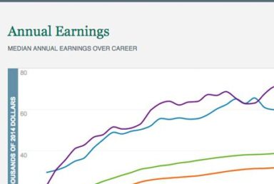
Career earnings by college major
See the accompanying economic analysis, "Major Decisions: What Graduates Earn Over Their Lifetimes." Over the entire working life, the typical college gra…
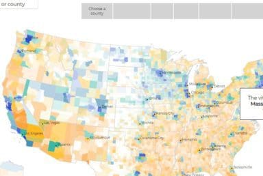
Exploring the geography of prosperity
We construct a composite measure of several different indicators to determine a county’s economic vitality. Employing a statistical technique called “confirmat…
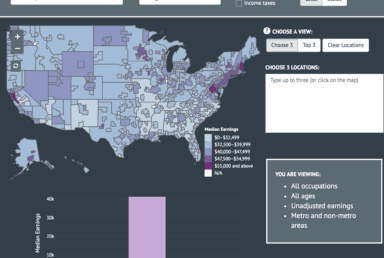
Where work pays: Occupations & earnings across the United States
This interactive chart accompanies an economic analysis, "Where Work Pays: How Does Where You Live Matter for Your Earnings?"Educational and occupational choic…
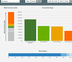
Putting your major to work: Career paths after college
This interactive chart accompanies an economic analysis, "Putting Your Major to Work: Career Paths after College."Students’ career paths after college are ofte…